OPEN Insight - Monthly
Overview
The Insight - Monthly dashboard gives you a quick overview of the most important key performance indicators (KPIs) for the previous month. This is your monthly summary that helps you track how your business is performing month by month.

Note: Data in this dashboard typically updates only once a month, so the figures reflect the most recently completed month.
How to Access the Dashboard
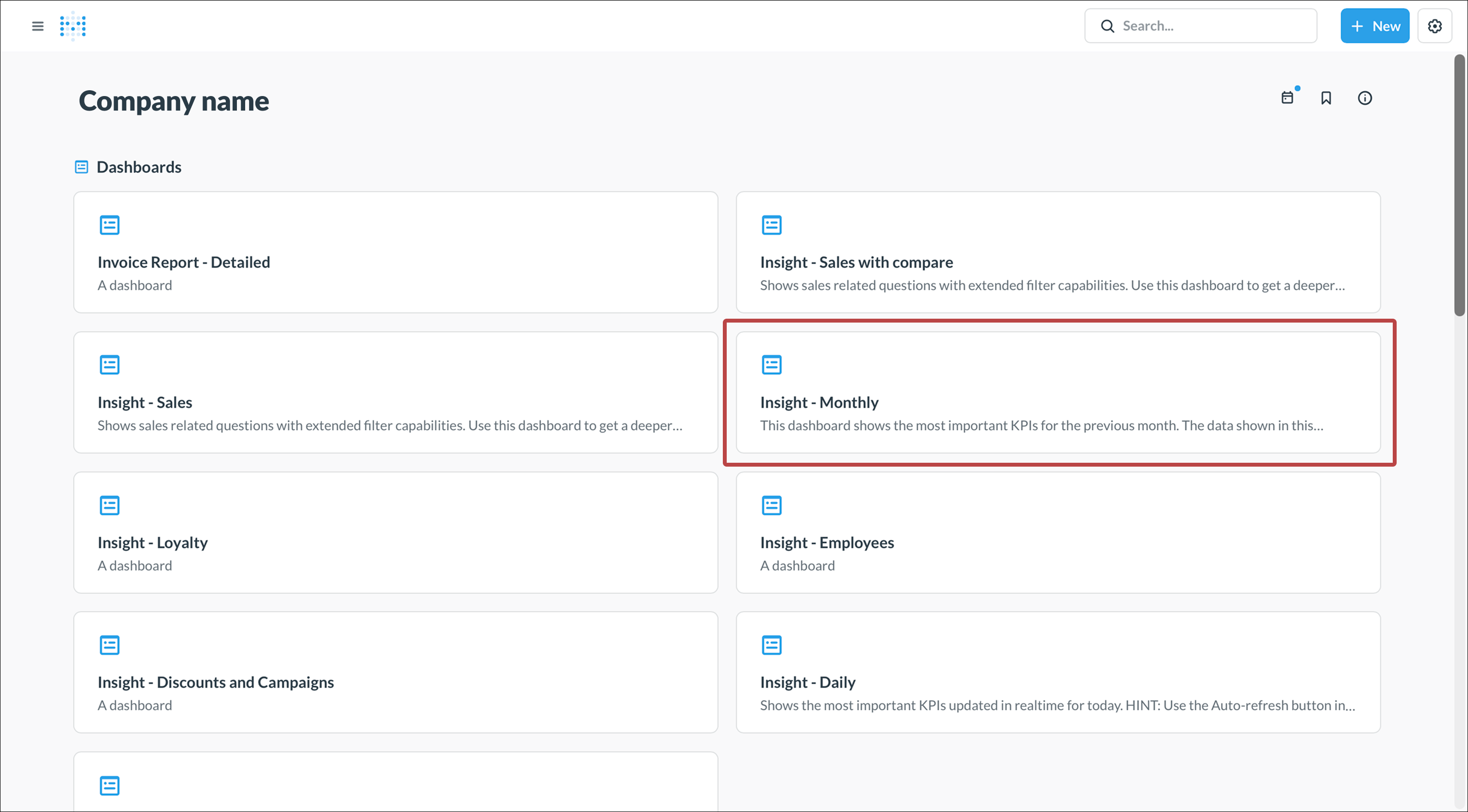
- Go to https://insight.one.openpos.tech and sign in with your credentials.
- The dashboard shows a variety of available reports.
- Click on Insight - Monthly, or use the search bar.

Understanding the Dashboard
Key Metrics - Last Month
On the left side of the dashboard, you'll see four important KPIs in card format:
Sales - Last Month
- Shows total sales for the previous month
- The red arrow and percentage show the change compared to the month before
- Helps you quickly see if sales are trending up or down

Sales excl VAT - Last month
- Same as above but excluding VAT/tax
- Useful for seeing your actual revenue
- Also shows comparison with the previous month

Average check - Last month
- Shows the average value per customer receipt
- Helps you understand how much each customer spends on average per visit
- A decrease might mean customers are buying less, an increase means they're spending more per visit

Discounts - Last month
- Shows total value of all discounts and campaigns given
- Helps you track the cost of your promotions
- Compare with previous month to see if discounting is increasing or decreasing

Returns - Last month
- Shows the total value of returned items or voided transactions for the previous month
- A high number of returns might indicate issues with product quality, customer satisfaction, or staff errors
- Compare with previous months to spot unusual patterns
- Can help identify training needs or product issues that need addressing

Sales per Month - Last Two Years
- Bar chart comparing sales between the current year (green) and previous year (purple)
- Makes it easy to see seasonal patterns and compare how the business has developed year over year
- Helps identify growth trends and seasonal variations

Sales per Week - Monthly
- Shows sales broken down by week
- Green bars show current year, purple bars show previous year
- Helps you see variations within the month and identify particularly strong or weak weeks
- Useful for planning staffing and purchasing based on expected sales

Sales per Day - Last Month
- Pie chart showing how sales are distributed across the days of the week
- Shows which days are strongest and weakest for your business
- Useful for optimizing opening hours and staffing levels

Sales per Hour - Last Month
- Stacked bar chart showing sales distributed by hour and weekday
- Each color represents a different weekday
- Clearly shows when during the day you have the most sales
- Helps you staff appropriately at the right times

Most Sold Articles - Last Month
- Pie chart showing your best sellers by sales value
- Helps you see which products are most important to your revenue
- Use this to ensure your top sellers are always in stock

Least Sold Articles - Last Month
- Pie chart showing your slowest sellers
- Products that sell rarely may be candidates for removal or repricing
- Could also be seasonal products that sell better at other times

Payment Methods - Last Month
- Bubble chart showing number of transactions per payment method
- The size of each bubble represents the number of payments
- Helps you understand how customers prefer to pay
- Can guide decisions about which payment methods to support

Sales per Person - Last Month
- Bar chart showing sales by employee
- Useful for tracking individual performance
- Can help identify training needs or reward top performers

Corrections per Person - Last Month
- Shows number of receipt corrections per employee
- Many corrections may indicate training needs or system difficulties
- Helps you identify if someone needs extra support or training

How to Use This Dashboard
Monthly Review
- Review the dashboard at the beginning of each month to see how the previous month went
- Compare key metrics with earlier months to identify trends
- Note both positive and negative changes
Planning and Scheduling
- Use "Sales per day" and "Sales per hour" to optimize staffing
- See when you need the most staff on site
- Adjust opening hours based on when sales are highest
Product Management
- Track your best and worst selling items
- Consider removing or repricing slow sellers
- Ensure you always have enough stock of best sellers
Staff Follow-up
- Use sales and corrections per person for individual conversations
- Identify training needs based on correction patterns
- Recognize and reward good performance
Tips for Success
- Set up a routine to review the dashboard every month
- Don't just compare with the previous month—also compare with the same month last year
- Consider seasonal effects when evaluating results
- Use the insights to set realistic goals for upcoming months
- Share relevant information with your staff to engage them in the business's development