OPEN Insight - Articles
Overview
The Insight - Articles dashboard helps you understand your product performance by showing which articles sell best and worst in your business. This information can guide decisions about inventory, pricing, and menu optimization to improve your profit margins.

The dashboard is organized into two main sections:
- Most sold articles - Your top performers by sales value and quantity
- Least sold articles - Your slowest movers by sales value and quantity
How to Access the Dashboard
- Go to https://insight.one.openpos.tech and sign in with your credentials.
- The dashboard shows a variety of available reports.
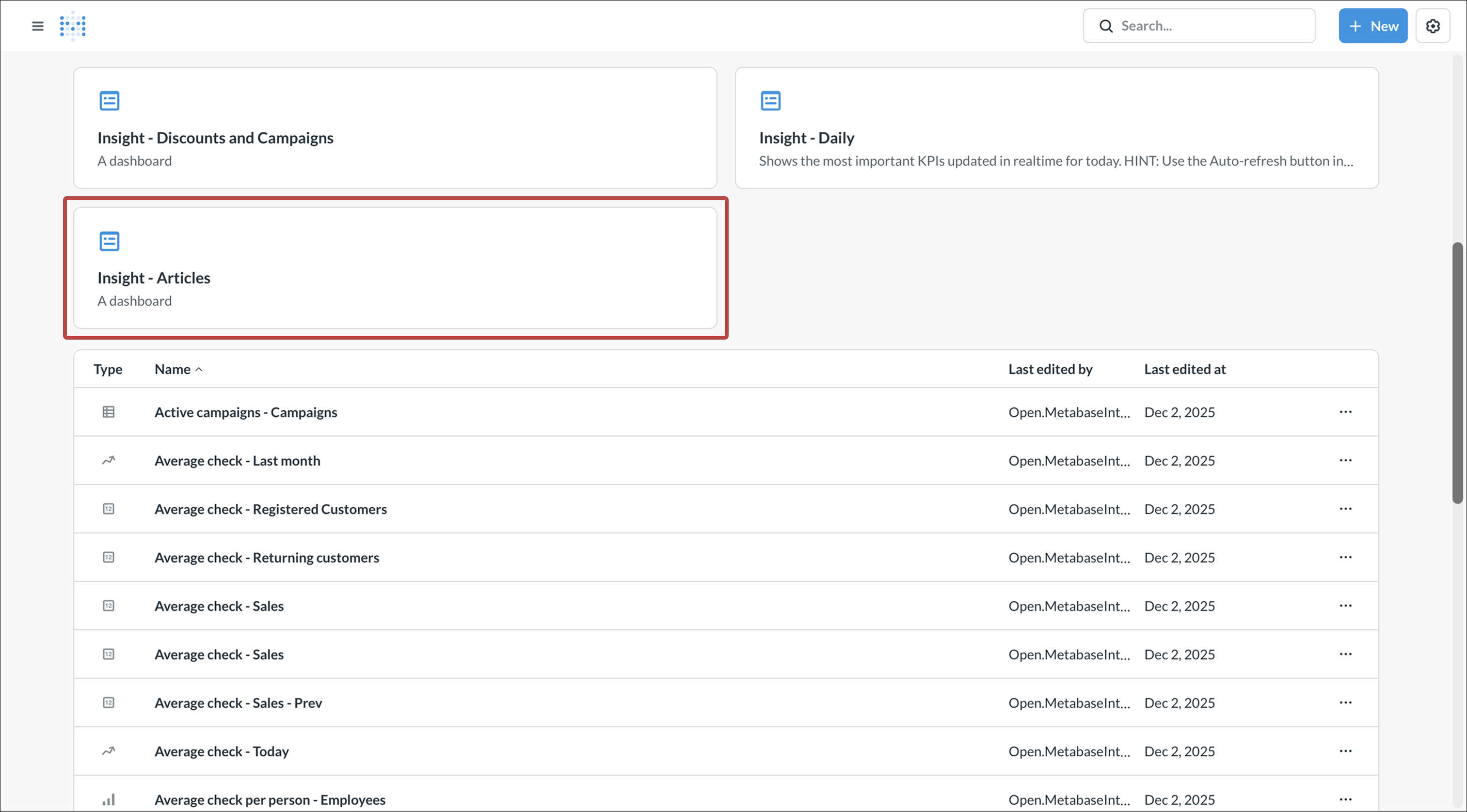
- Scroll down and tap Insight - Articles, or use the search bar.


Understanding the Dashboard
Most Sold Articles Section
This section shows your best-selling products and helps you understand what drives your revenue.
Portion of most sold articles (pie chart)
- Shows the breakdown of your top sellers as percentages of total sales
- The chart groups articles by category, making it easy to see which product types dominate your sales
- The total sales value is displayed in the center

Most sold articles - Articles (horizontal bar chart)
- Lists your top-selling articles ranked by sales value
- Each bar represents the total revenue generated by that article
- Helps you identify which specific items generate the most income

Portion of number of sold (pie chart)
- Similar to the first pie chart, but focused on quantity sold rather than sales value
- Shows which articles are ordered most frequently
- The total quantity sold is displayed in the center

Most number of sold - Articles (horizontal bar chart)
- Lists your top-selling articles ranked by quantity
- Shows which items are purchased most often by customers
- Useful for understanding customer preferences and managing inventory

Combination articles - Articles (data table)
- Shows which articles are frequently purchased together
- The left column lists your best-selling items (by sales value)
- The following columns show what customers typically buy alongside each item
- Numbers in parentheses indicate how many times that combination occurred
- Useful for creating combo meals, suggestive selling, or optimizing product placement

Least Sold Articles Section
This section identifies underperforming products that may need attention.
Portion of least sold articles (pie chart)
- Shows which categories contain your slowest sellers by sales value

Least sold articles - Articles (horizontal bar chart)
- Lists articles with the lowest sales value
- Helps identify products that may need promotion, price adjustment, or removal from your menu

Portion of least number of sold (pie chart)
- Similar view but focused on quantity rather than value
- Shows which articles are ordered least frequently

Least number of sold - Articles (horizontal bar chart)
- Lists articles with the lowest quantity sold
- Useful for identifying items customers rarely choose

Using the Filters
At the top of the dashboard, you'll find several filter options to customize your view:

| Filter | Function | Comment |
|---|---|---|
| Date | Select your time period for analysis | Default is "Previous 3 months". Use this to compare different periods or focus on recent performance |
| Items to show | Adjust how many articles appear in each list | Default is 10. Increase this number to see more articles in your rankings |
| Weekdays (1-7, comma separated) | Filter by specific days of the week | Analyze weekend vs. weekday performance patterns. Enter numbers 1-7 where 1=Monday, 7=Sunday |
| Articles | Include specific articles in your analysis | Focus on particular products you want to analyze |
| Exclude Articles | Remove specific items from all views | Helpful for filtering out items that might skew your data (e.g., test products or discontinued items) |
| Sale categories | Filter by specific sales categories | Analyze particular segments of your menu (e.g., beverages, food, alcohol) |
| Exclude sale categories | Remove entire sales categories from your analysis | Useful for focusing on specific parts of your business while hiding others |
| Product categories | Filter by specific product groups | Drill down into specific product types within your menu |
| Exclude product categories | Remove entire product groups from your analysis | Focus on particular menu sections by excluding others |
How to Use This Dashboard
Viewing detailed information
- Click on any chart to enlarge it for a better view
- In the enlarged view, you can interact with the data and apply additional filters
Analyzing your top performers
- Review your most sold articles to ensure these items are always in stock
- Check the combination articles table to identify opportunities for meal deals or bundles
- Compare sales value vs. quantity to understand your pricing effectiveness
Addressing underperformers
- Review your least sold articles regularly
- Consider whether these items should be promoted, repriced, or removed from your menu
- Low performers that tie up inventory may be reducing your profitability
Making data-driven decisions
- Use the date filter to compare different time periods and identify trends
- Filter by weekday to optimize your menu for different days
- Use category filters to evaluate different sections of your menu separately
Tips for Success
- Review this dashboard regularly (weekly or monthly) to stay on top of sales trends
- The unique articles counter in the top-right shows your total product variety—use this to track menu complexity
- Combination articles data can inform cross-selling strategies and staff training
- Consider seasonal factors when analyzing underperforming items—some products may perform better at different times of year